Bilfit Website
A composed digital presence for Bilfit AG. Clear structure, restrained UI, and a user experience that reflects the company’s character without trying to dominate it.
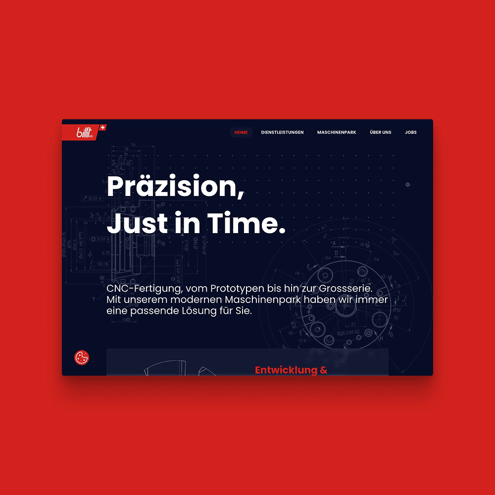
Quiet Design. Clear Signal.
The Bilfit website was created as a digital space that feels controlled, focused, and trustworthy. It is built for customers and partners who value clarity over noise and substance over spectacle.
The site exists to translate Bilfit’s character into a digital experience. Precise. Calm. Reliable.
Content is easy to scan. Navigation stays predictable. Nothing distracts from the message. The interface does not try to impress. It simply works.
This approach turns restraint into strength. Users stay oriented. Information is accessible. The brand speaks through consistency rather than volume.
Design and Engineering That Stay Focused
Reduced Interfaces That Feel Natural
The UX and UI design follows one clear principle: remove everything that does not add value. Layouts are structured, spacing is deliberate, and typography supports fast reading.
Visual elements never compete for attention. Hierarchies are clear at first glance. Users understand where they are and where to go next without thinking.
Complexity was reduced through consistency and repetition. The experience feels familiar from the first click. This creates trust and keeps the focus on content and intent rather than interface mechanics.
A Stable Platform That Supports the Message
The website was developed on WordPress to provide a flexible and maintainable foundation. Content can be updated efficiently. The system stays stable under daily use.
Design and technology in harmony
UX and UI with consistent reduction
The UX and UI design follows a reduced approach. Every element has a clear function. Spacing creates structure. Typography supports readability.
The page structure remains consistent across all areas. Users immediately recognize connections and move confidently through the content.
Complexity was deliberately removed. The result is calm, intuitive user guidance that keeps the focus on content and message.
Technical implementation without unnecessary weight
The implementation was carried out with WordPress as a stable and maintainable foundation. Content can be managed easily. The platform remains reliable in daily use.